Reports
How do I read the Spending Breakdown graph?
Understand the Spending Breakdown graph on the Finance AI home screen and drill into the categories behind your spending.
Quick answer
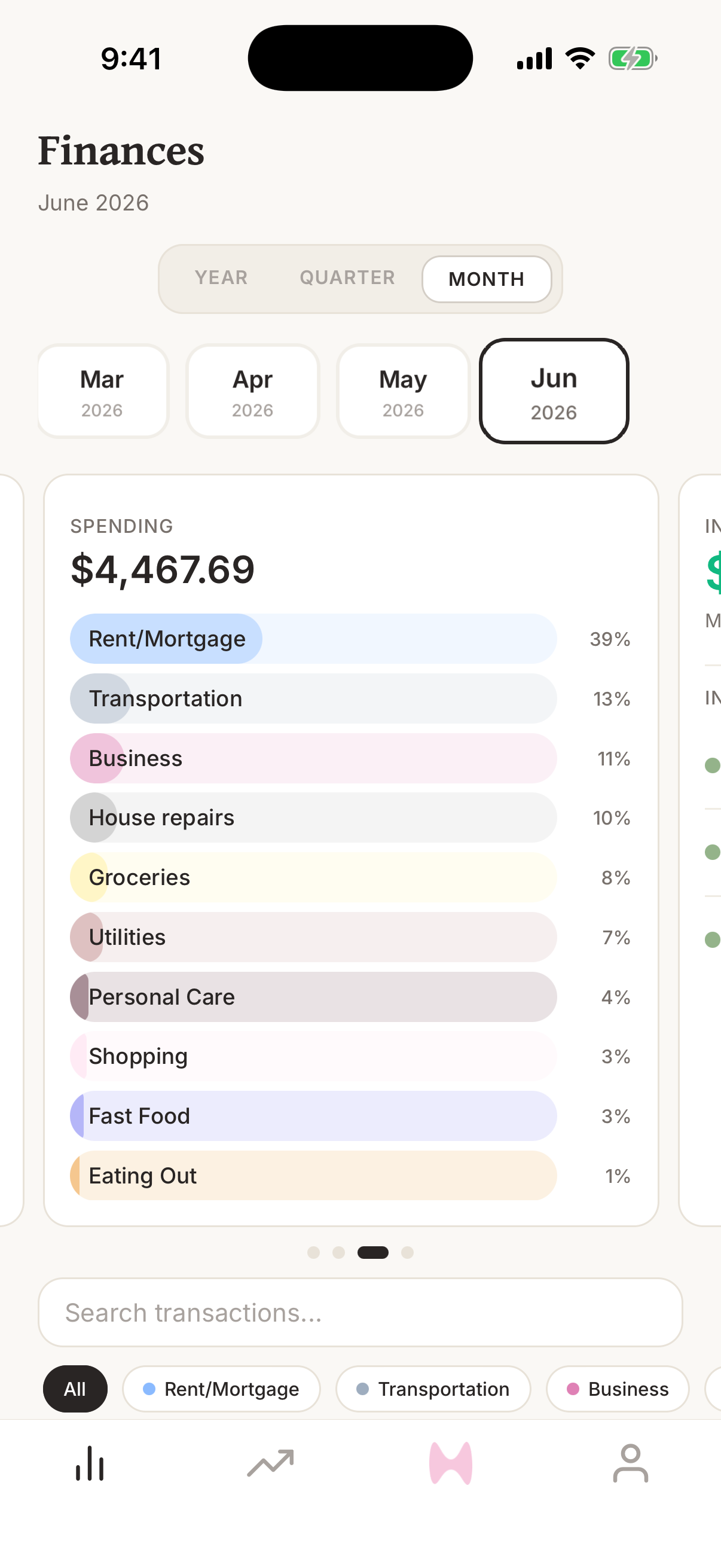
The Spending Breakdown graph shows spending grouped by category for the selected period. Tap a category in the legend to see the transactions behind that slice.
Steps
- 1Open Finance AI on your iPhone.
- 2Go to the home screen.
- 3Swipe the graph carousel until you see Spending.
- 4Read the headline amount as total spending for the selected period.
- 5Review the category legend to see which categories make up the total.
- 6Tap a category to expand the transactions behind that category.
- 7Tap a transaction if you need to review or correct its details.
What the categories show
Each slice represents a spending category for the selected period. Larger slices are categories where more money has gone during that period.
The total includes pending and posted ordinary spending, while excluding income categories and transfer categories. A pending purchase can move to another category or change amount when it posts.
How to investigate a slice
Tap a category in the legend to expand it. Finance AI shows both pending and posted transactions behind that category, including merchant, date, account, and amount.
From there, tap a transaction to open the detail screen. This is the fastest way to find a transaction that belongs in a different category or month.
How to fix the breakdown
The breakdown is only as accurate as the transaction categories and dates behind it. If a slice seems too high or too low, inspect the transactions inside it.
- Change a transaction category when it is grouped under the wrong slice.
- Change a transaction date when it belongs in a different month.
- Create or edit categories if your current category list does not match how you want to review spending.
Frequently asked questions
How do I read the Spending Breakdown graph?
The Spending Breakdown graph shows spending grouped by category for the selected period. Tap a category in the legend to see the transactions behind that slice.
What the categories show?
Each slice represents a spending category for the selected period. Larger slices are categories where more money has gone during that period. The total includes pending and posted ordinary spending, while excluding income categories and transfer categories. A pending purchase can move to another category or change amount when it posts.
How to investigate a slice?
Tap a category in the legend to expand it. Finance AI shows both pending and posted transactions behind that category, including merchant, date, account, and amount. From there, tap a transaction to open the detail screen. This is the fastest way to find a transaction that belongs in a different category or month.
How to fix the breakdown?
The breakdown is only as accurate as the transaction categories and dates behind it. If a slice seems too high or too low, inspect the transactions inside it. Change a transaction category when it is grouped under the wrong slice. Change a transaction date when it belongs in a different month. Create or edit categories if your current category list does not match how you want to review spending.